One of my roommates is a statistics PhD so I thought I might try looking at a statistics paper. Or, honestly, just the code from a statistics paper. Actually understanding the entire paper would require way more time than I am willing to devote to a single blog post.
This month’s paper: Nicol PB and Miller JW. Model-based dimensionality reduction for single-cell RNA-seq using generalized bilinear models. Biostatistics 2025. doi: 10.1093/biostatistics/kxaf024
Original code
This paper’s code is on GitHub.
Critique
Standard disclaimer: issues with published code are not necessarily anyone’s fault, and often are due to nothing more nefarious than time constraints.
Give your code some space
This paper released an R package. Its README has code samples. Unfortunately for my eyes, the writer seems to not like the spacebar. See:
I <- 500
J <- 500
Y <- matrix(rpois(I*J,lambda=1),nrow=I,ncol=J)
colnames(Y) <- 1:J; rownames(Y) <- 1:I
By inserting a few spaces, we can make that third line scan better:
Y <- matrix(rpois(I*J, lambda=1), nrow=I, ncol=J)
Spaces between each of the arguments makes it easier to visually separate them.
Now I can see that I goes with nrow instead of ncol.
Then later we have:
library(Seurat)
Sco <- CreateSeuratObject(counts=Y)
colnames(out$scores) <- 1:10
Sco[["gbm"]] <- CreateDimReducObject(embeddings=out$scores,key="GBM_")
Sco <- FindNeighbors(Sco,reduction = "gbm")
Sco <- FindClusters(Sco)
Note that second-to-last line. It would be easier to scan which parts go
together if spaces were between arguments and not around the = sign. The
other keyword arguments don’t use spaces around the =. Dunno
why they exist here. Be consistent, folks!
Providing example outputs is good
The demo includes not only code samples, but also what that code outputs. That might seem small, or like a waste of space if the reader is focusing on code examples, but it’s incredibly important.
- A user can follow along with the code samples and compare their output against the examples. This is great for trying out a new package. It’s also a boon to debugging help to figure out if a problem comes from the package or if you’re just using it wrong.
- It’s easy to figure out what this package can do by simply scanning the outputs. If I’m want, say, bespoke heatmaps, then it helps to see examples of what a given package can do. I can then decide whether to invest more time.
- If the outputs are automatically generated, they provide a sort of test. Note that this README has an RMarkdown version. If that fails to produce one of the demo plots, then Houston, we have a problem.
… but those example outputs should be usable
One of the example outputs is this heatmap:
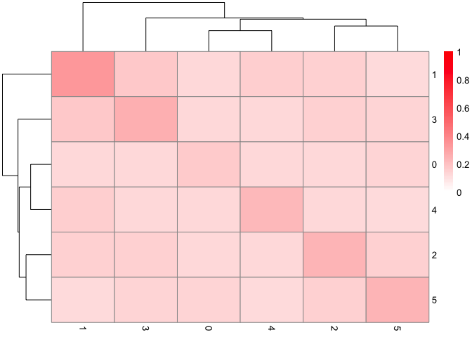
Um. What is this? I understand this is just an example, but I’d like to be able to look at it and understand what it’s an example of. This isn’t a blog on how to make good plots, I know, but… at least put usable labels? I think those numbers on the side correspond to clusters. Just slap “cluster” on as an axis label, and then a casual reader will instantly understand the point of making this plot. It shows similarities between clusters! That’s something you want to sell as a functionality. I think. I dunno what stats people are looking for.
In general, if you’re displaying an example output in a bid to sell your package as a useful tool, it would help for that example output to be a good example of what someone might actually use. Think of each output as a pitch for your tool. If it’s a good pitch by itself, people will remember it well. And by extension, they’ll remember your tool.
If there’s a recent paper you’d like me to look through, shoot me an email. Address in my CV.